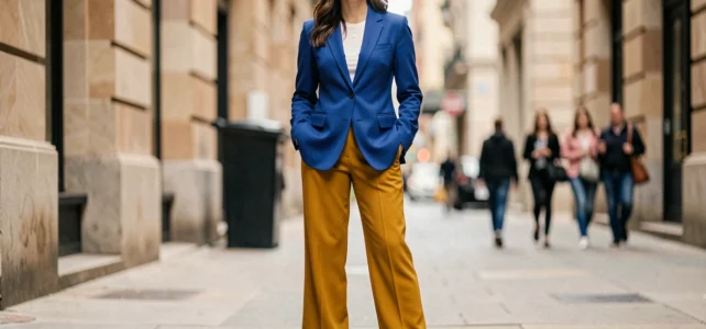
Combining three bright colors in the same outfit relies on a principle of distributing colored volumes. When two saturated shades already occupy most of the look, the choice of the third color determines whether the overall appearance seems controlled or overloaded. Understanding how this third tone interacts with the first two allows for the creation of readable combinations, even with bold hues.
Saturation and the pivotal role of the third bright color
The difficulty does not come from the number of colors but from their combined saturation levels. Two bright colors side by side already create a strong visual tension. Adding a third equally saturated shade without caution creates a competitive effect among the three colored areas, and the eye no longer knows where to settle.
The third color acts as a visual pivot that guides the reading of the outfit. It can calm the contrast between the first two or, conversely, amplify it in a specific direction. It all depends on its temperature (warm or cool) and its relative brightness.
Specifically, if your first two pieces are a turquoise top and cherry red pants, a third color like dark brown (bag, belt, shoes) anchors the outfit in a dense base. This type of combination, mentioned in the 2026 trend analyses, illustrates how a deep color stabilizes two saturated tones without dulling their energy. The brown absorbs some of the visual vibration and provides a resting point for the gaze.
Finding 3 colors that go well together according to Maison de Mode helps visualize tested palettes before composing your own.

Calibrated contrast or tone-on-tone harmony: two logics for three colors
Combinations of three bright colors follow two distinct logics. Understanding which one you apply helps avoid mixing registers in the same look.
Calibrated contrast logic
Calibrated contrast involves choosing three colors that are far apart on the color wheel, ensuring that only one dominates the surface. The principle: one color occupies the majority of the outfit, the second constitutes a secondary block, and the third appears in touches.
The 2026 trends move away from quiet luxury to return to a more expressive aesthetic. Color blocking is making a comeback in street style with blocks of bold colors. In this logic, a bright yellow look (wide pants) paired with sky blue (shirt) and an accent of brick red (structured bag) works because each color has a clear territory on the silhouette.
Close harmony logic
Close harmony uses three neighboring colors on the spectrum (analogous) but in different saturations. Fuchsia pink, orange-red, and coral form a vibrant trio that remains readable because the shades share a common base. The risk here is monotony if the three tones are too close in brightness.
To avoid this pitfall, vary the brightness among the three pieces: one dark tone, one medium tone, one light tone. This gradation creates relief even when the colors belong to the same family.
Surface distribution: the rule that changes the outcome
Three bright colors in equal proportions almost always produce a costume effect. The distribution of surfaces on the body determines the perceived balance as much as the choice of shades.
- The dominant color covers the largest area (pants, dress, coat) and sets the overall tone of the look.
- The secondary color occupies a visible but more restricted piece (top, short jacket, skirt) and creates a dialogue with the dominant color.
- The accent color appears on accessories or a clothing detail (belt, bag, shoes, scarf) and adds a touch of surprise.
This hierarchy allows each shade to play its role without overshadowing the others. The approximate ratio works around 60-30-10 between dominant, secondary, and accent, but adapting it to your body shape and the cut of the pieces matters more than a rigid calculation.

Anchoring bright colors with a dense base rather than a cool neutral
Feedback from experts and retailers in 2026 indicates a change in practice: bright colors appear more wearable when anchored by a dense base (chocolate, navy, ecru, dark denim) rather than by classic cool neutrals like gray or pure black.
Black, long a default reflex, tends to harden saturated colors and create a binary contrast. Navy or chocolate brown, on the other hand, absorb brightness without cutting it. If your third color is an accessory in one of these deep tones, it connects the two bright colors instead of isolating them.
This does not mean banning black. Black pants with a fuchsia top and a lemon jacket can work if the black remains confined to the lower body and the two bright colors interact on the bust. The trap is using black as the dominant color: the two bright colors then become mere accents and lose their impact as a boldly colored outfit.
Testing a trio before wearing it: quick method
Before assembling three bright pieces, a simple check allows you to anticipate the result.
- Lay the three garments flat, side by side, in the proportions you will wear. Step back a meter and observe: if one color disappears visually, it lacks contrast with its neighbors.
- Photograph the whole with your phone. The screen reduces size and simulates the distant view, the one others will have of you on the street.
- If the trio seems too overloaded in the photo, replace the largest piece with a slightly less saturated version of the same shade (a tomato red instead of a vermilion red, for example).
This method takes two minutes and avoids unpleasant surprises in front of the mirror in the morning. The distant photo test remains the most reliable filter for assessing the balance of a colorful trio.
The combination of three bright colors relies less on rigid rules than on a principle of visual hierarchy and controlled temperature. A trio where each shade has its territory on the silhouette, with a dense base to anchor it all, produces an energetic and readable look, even in everyday life.